-
Jon Hoskins of Ocean Shores, Washington posted an update in the Beta Testing group
 Beta Testing – BUGS December 22, 2016 @ 12:11 pm
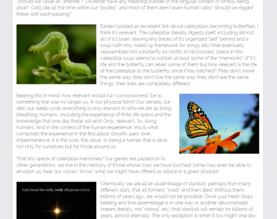
 Windows 10 Pro, Chrome browser. I’ve noted that formatting, at least in publishing “Articles”, is not wholly preserved between viewing the article from a direct link to it and viewing it in the editor or on my personal time line. The latter is correct. When I click the link in my timeline, some of the formatting is lost.
The attached photo shows the editor view where images have a given alignment. This alignment is lost if I click the link to the actual article: https://pantheism.com/death-afterlife-before-life-whats-the-difference/


Thanks for the report, @jon_hoskins. This was a styling (CSS) issue…I call for the first (Featured) image to float left…but my code was actually catching and overriding all the image alignments thereafter. This is now fixed. The only thing I couldn’t fix was the layout you were going for by adding in an extra div before the last paragraph. I manually added a non-breaking space (& nbsp;, minus the space) into that div to get it to align the way you wanted. Of course, don’t forget, these articles look different depending on what size the browser window is. The whole site is responsive, so it will shift around. Anyway…please give it a try now. Thanks!
Just trying to do what I can to test the site and report problems I might find. Getting my articles to format properly is of secondary concern. 😉
What about formatting it similar to FB “Notes” (which I have grown fond of) in that any “featured” image acts as a header, centered across the top, with text and any additional content following below?